Vme TV Rebrand

With a new on-air structure and a brand makeover, Vme's digital presence required renovation in order to maintain an omnichannel experience. My team and I sought this opportunity to also improve interaction and increase user engagement, all while continuing to entice viewership to the TV.

To comply with my non-disclosure and confidentiality agreement, I have omitted confidential information. These designs are reinterpretations of the original project.

Client: Vme TV
Role: Senior UI/UX Designer
Date: May 2019 - October 2019
Background

Vme Bloques

Since its 2017 transition from public broadcasting to cable/satelite television, Vme evolved beyond its previous identity and was now ready to reposition itself in its new environment. The ambition to change was driven by the same fervor that launched Vme TV 10 years prior: to educate, entertain and inspire a new community of Hispanics and Latinx viewers.

With this revamp, Vme is recommitting itself to the "televidente diferente" by embracing and celebrating more than just its own original content, but an assortment of diverse genres called, "Vme Bloques," or "Vme Blocks." The famed logo also received an update- modest at first glance but unequivocally effective in application. Its simplicity allows for elasticity when applied within the entire Vme Block universe.

Fluent in Vme

Vme developed a simple and elegant visual language that allows the brand to take its place at the center of everything- a sort of fleuncy, if you will. Original programming pops while acquired shows take on a new life. And the proprietary 'Vme Avenir' font ties everything together.

My Role

Once this new format was finalized, I had the privilege of applying Vme's entirely new visual identity online while devising and implementing a new IA to coincide with Vme's on air structure. My first priority was to bring awareness and understanding of the high-level business and UX goals, and then lead the team through a comprehensive research phase to document the user goals. I led both the research and design phases including prototyping and testing. I worked alongside a Researcher, Content Strategist and a Marketing Manager.

In addition, I worked closely with a team of front-end and back-end developers to ensure smooth transitional phases between: design, prototyping, and development.

The Challenge

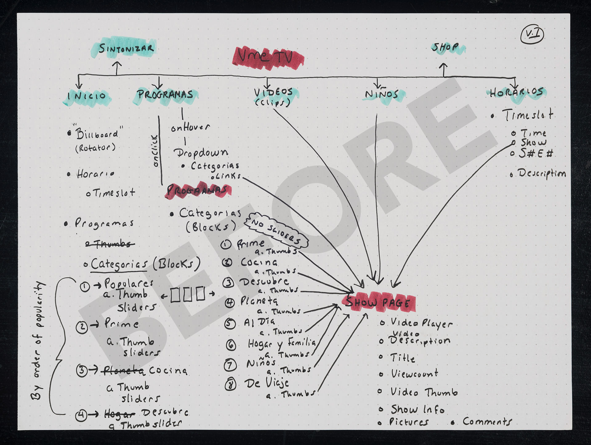
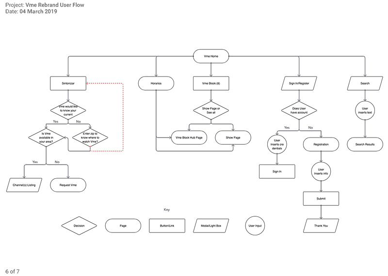
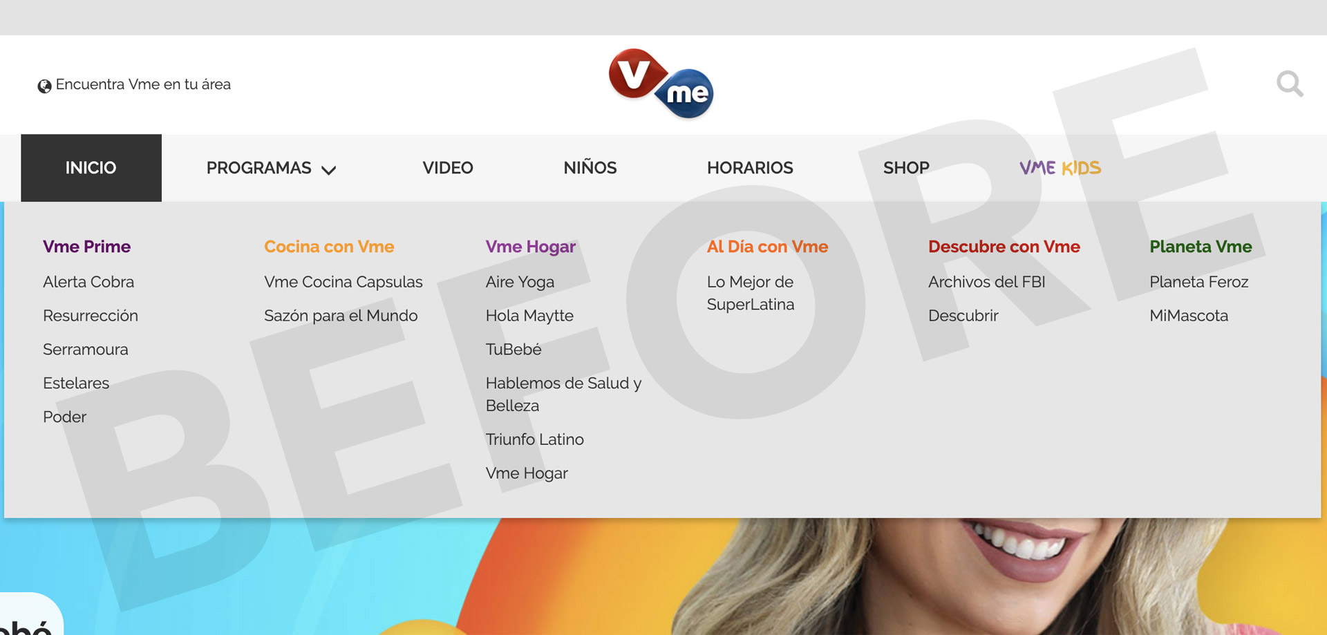
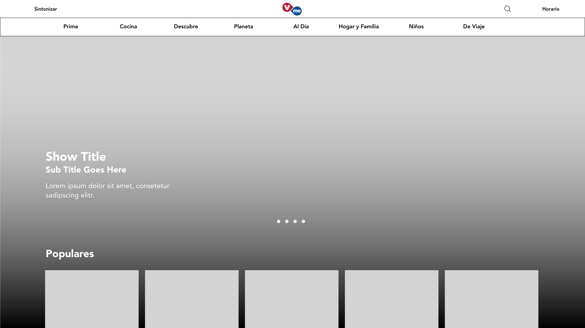
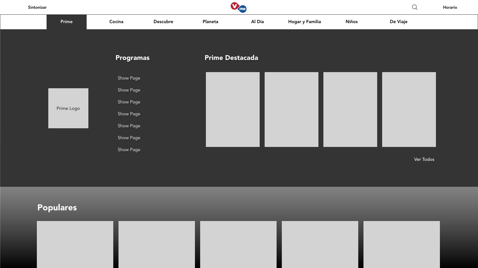
Our ambitions were to create a new digital experience, crisp and fresh, while still bearing resemblence to a product that current/past users would still recognize. Initially, before devling into the UCD nitty gritty, I like to acquaint myself with the current project's IA so I sketched out a site map of the current Vme website. It indicated many areas that needed attention. This helped me coordinate user goals with our board members' goals.

Business Goals

After a couple of brainstorming sessions with Stakeholders, Marketing and Programming, I was able to formulate and establish a set of Business Goals that the new redesign must satisfy:

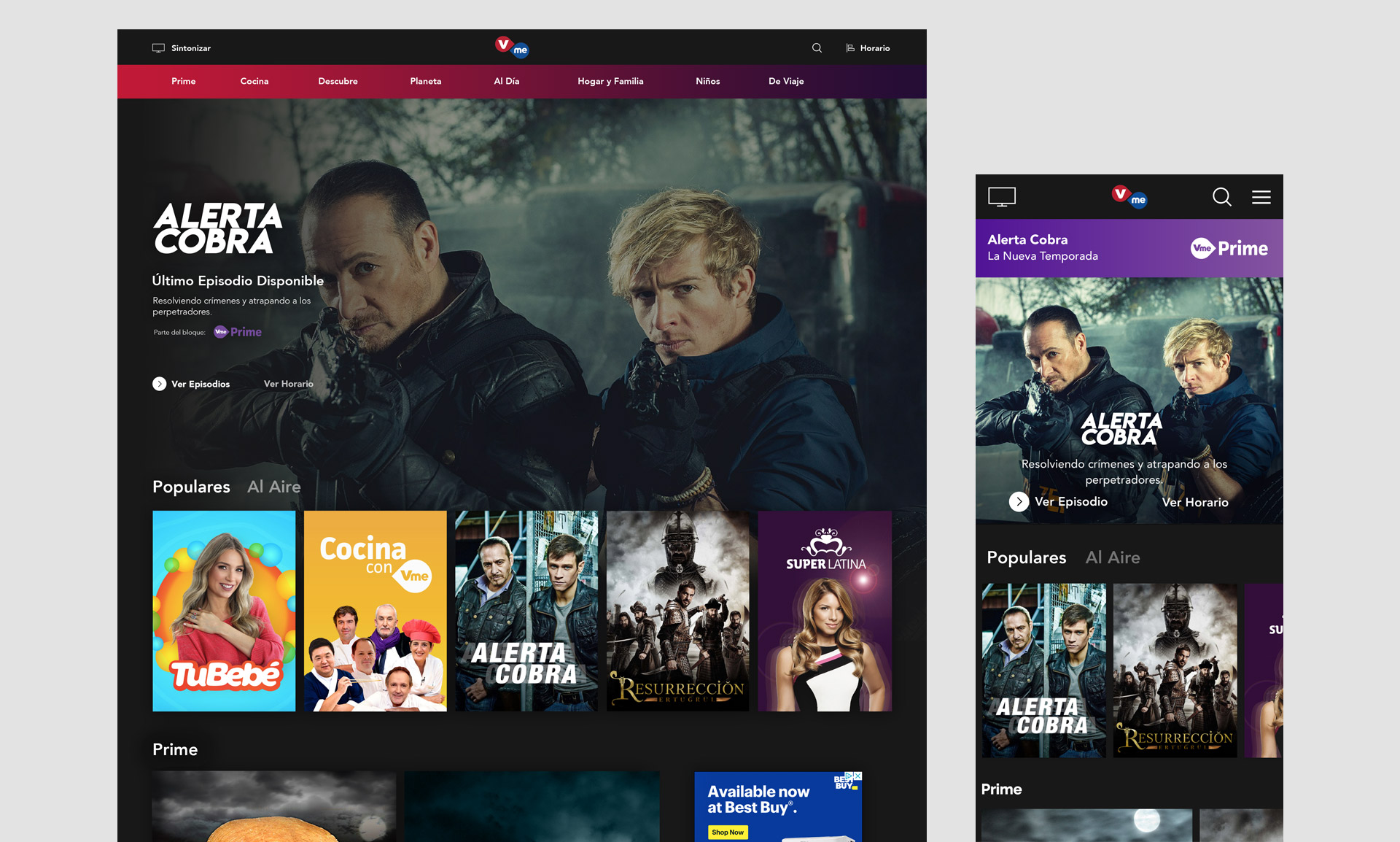
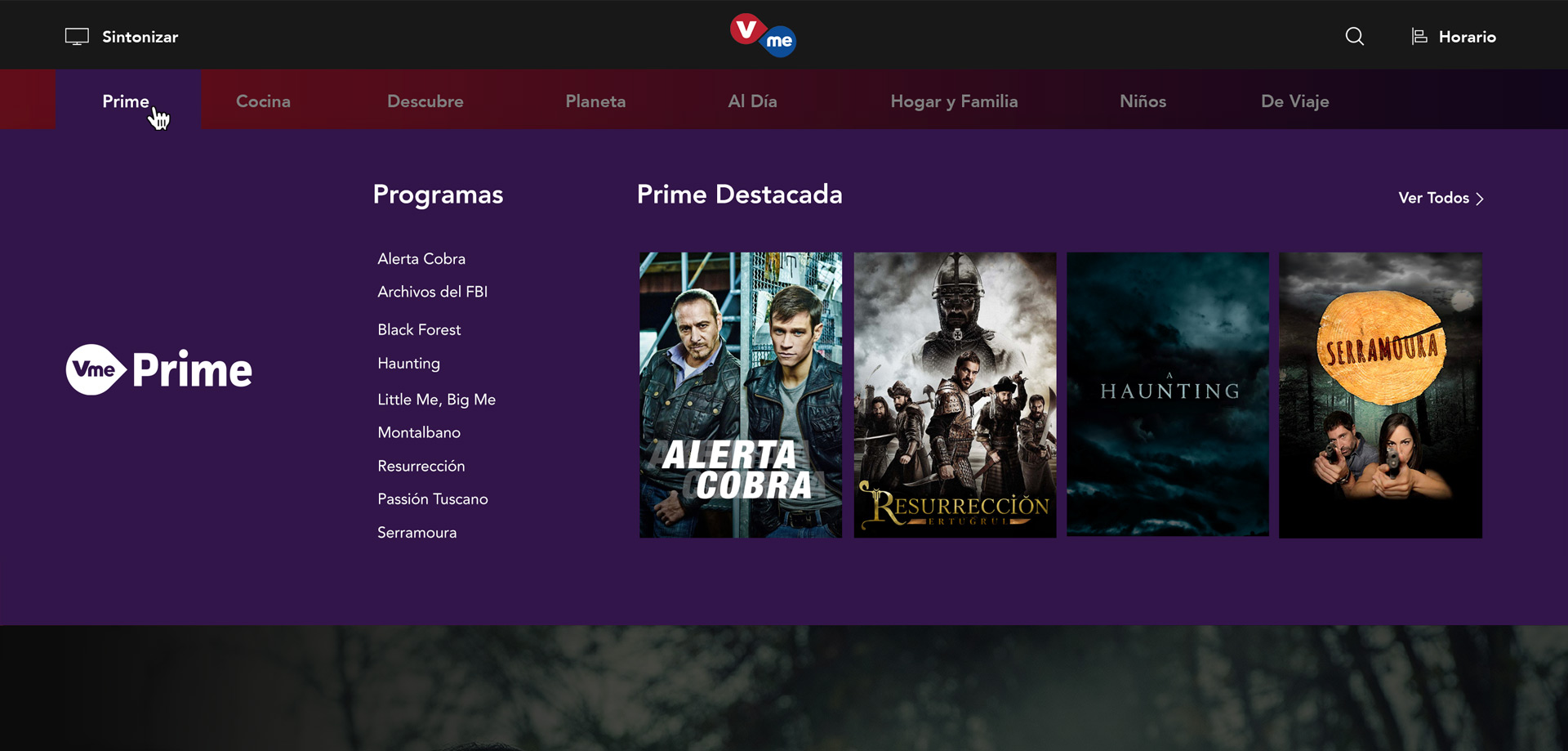
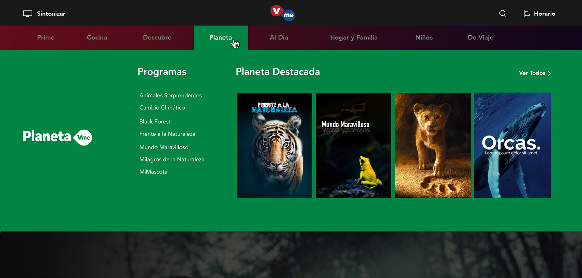
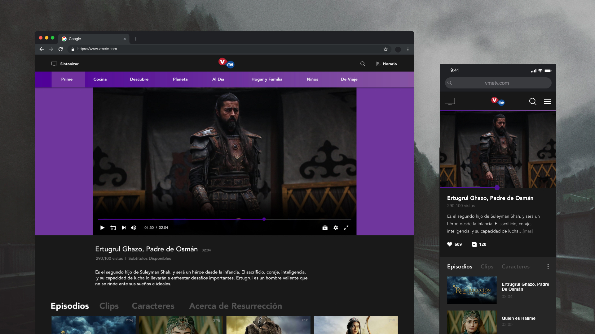
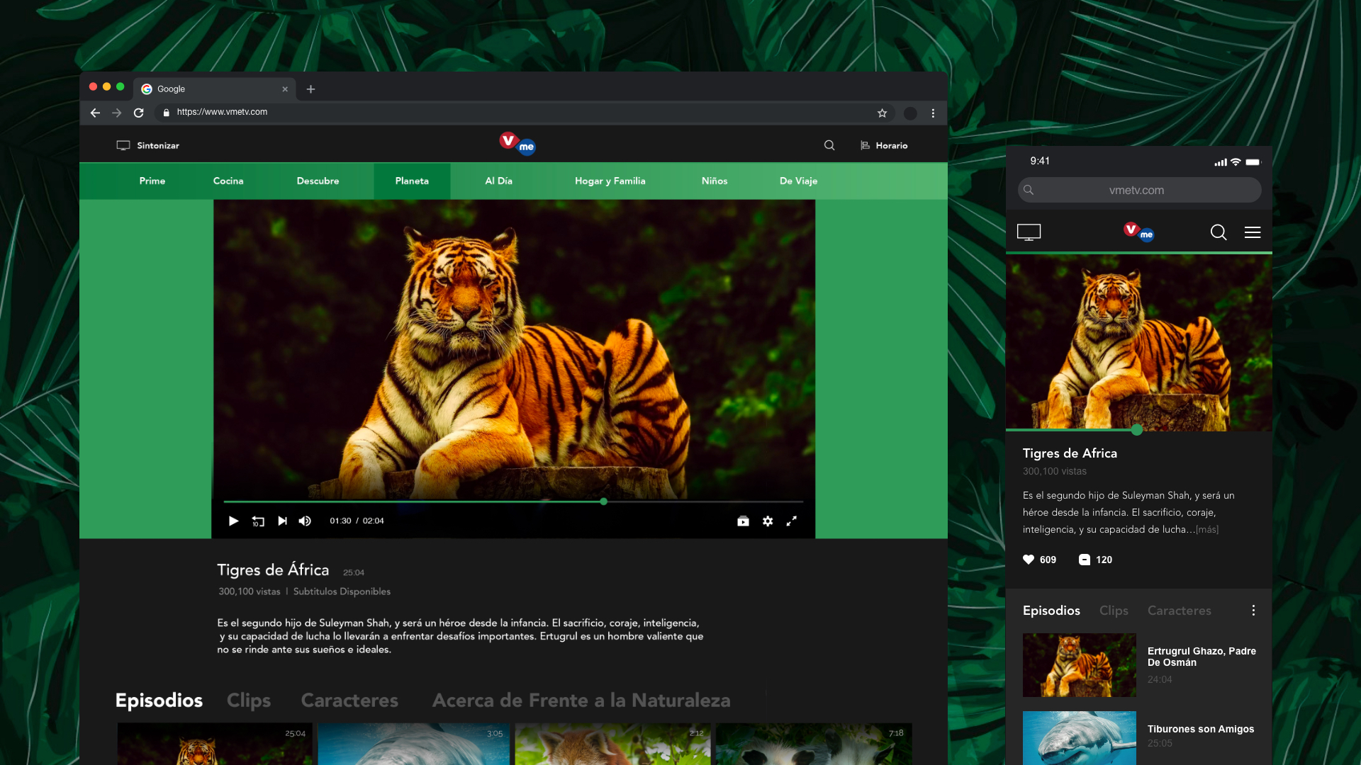
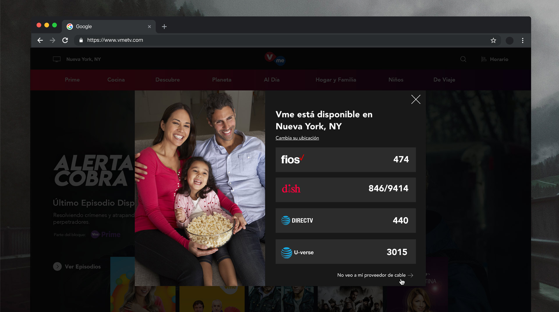
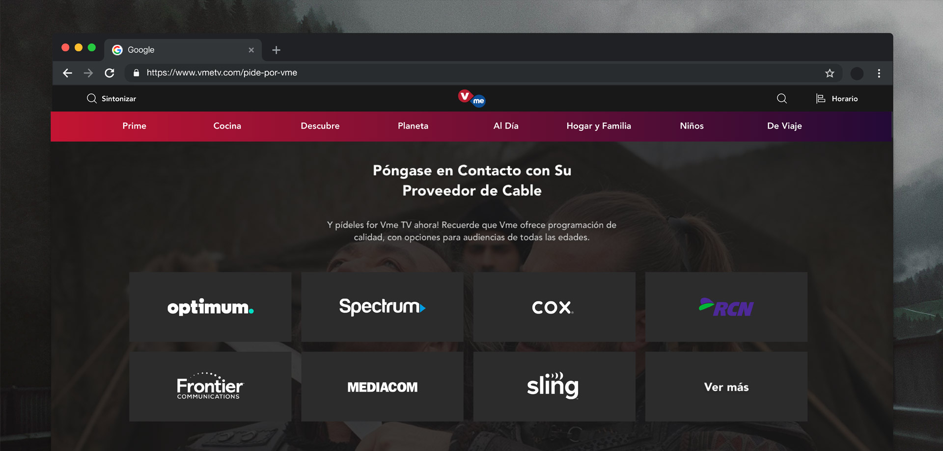
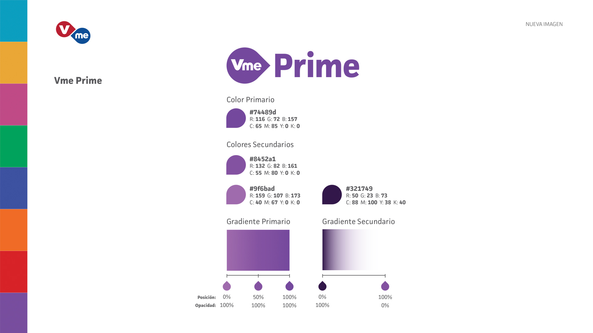
  1. Ensure a complete omnichannel experience of TV and Web by implementing Vme's updated aesthetic online.

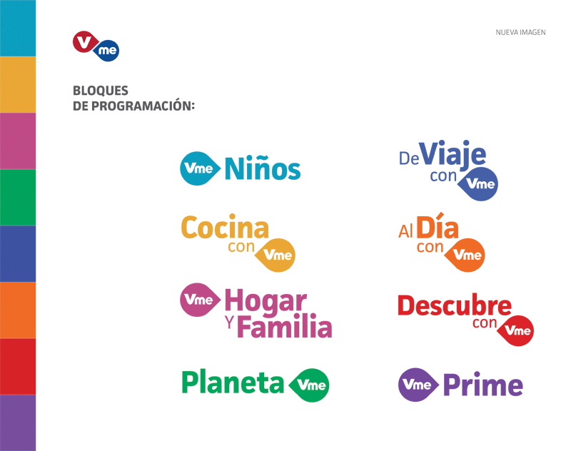
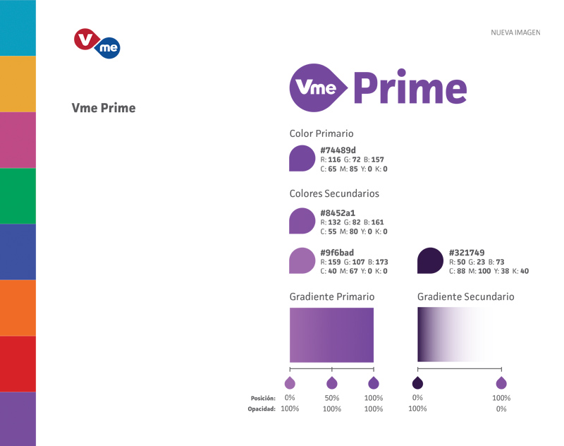
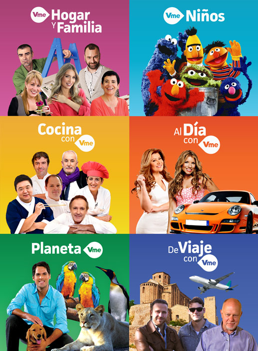
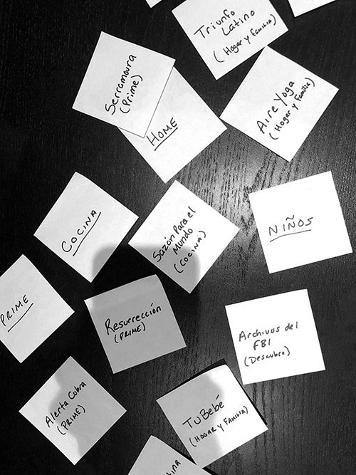
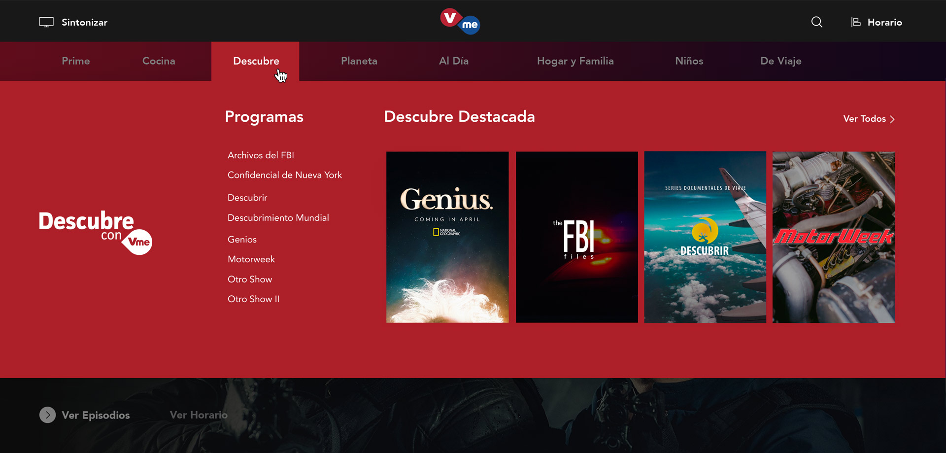
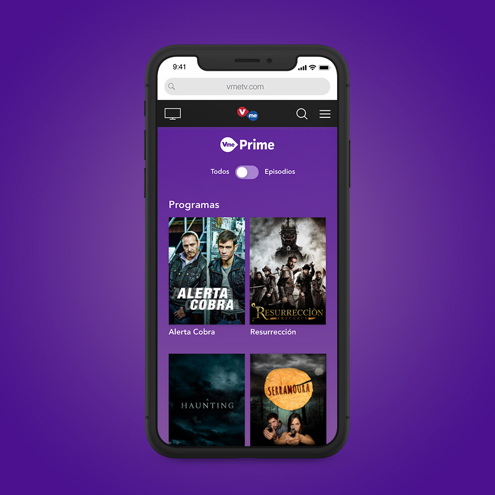
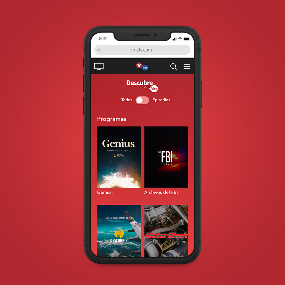
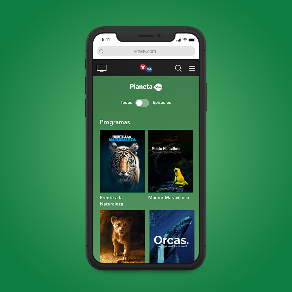
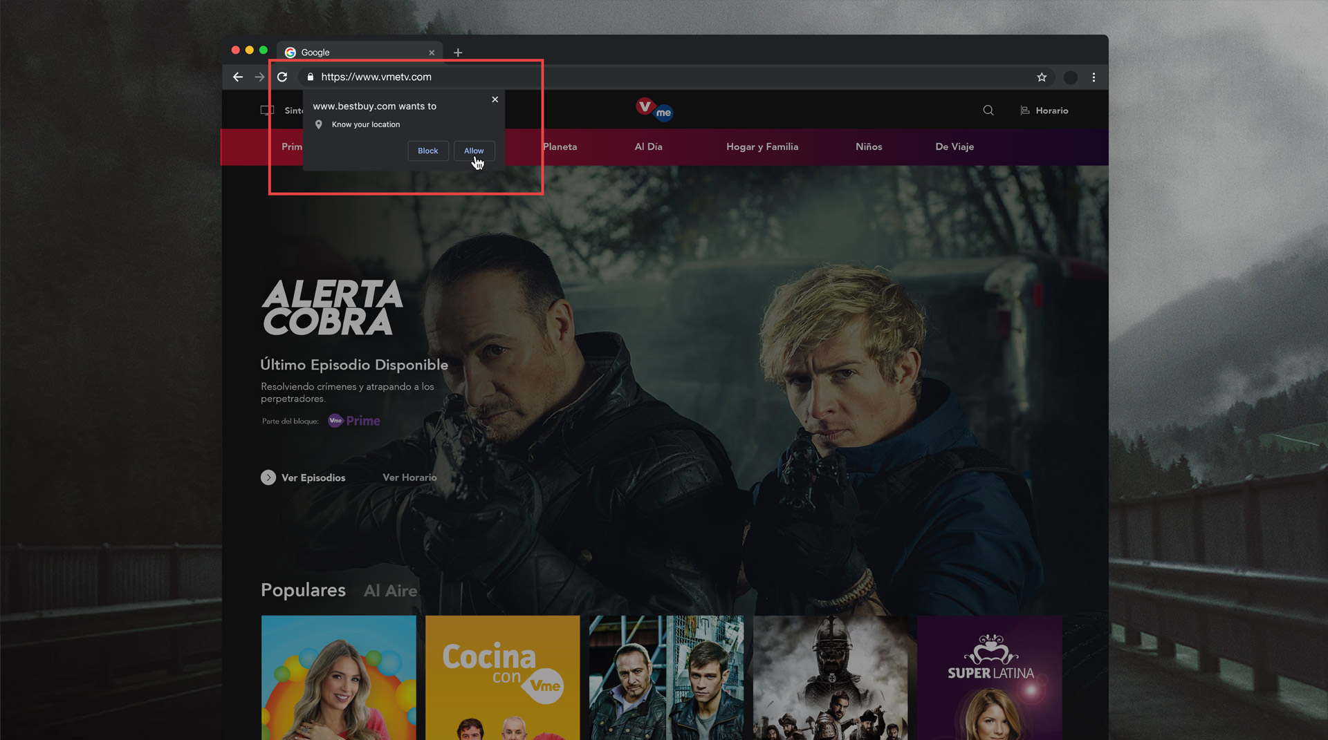
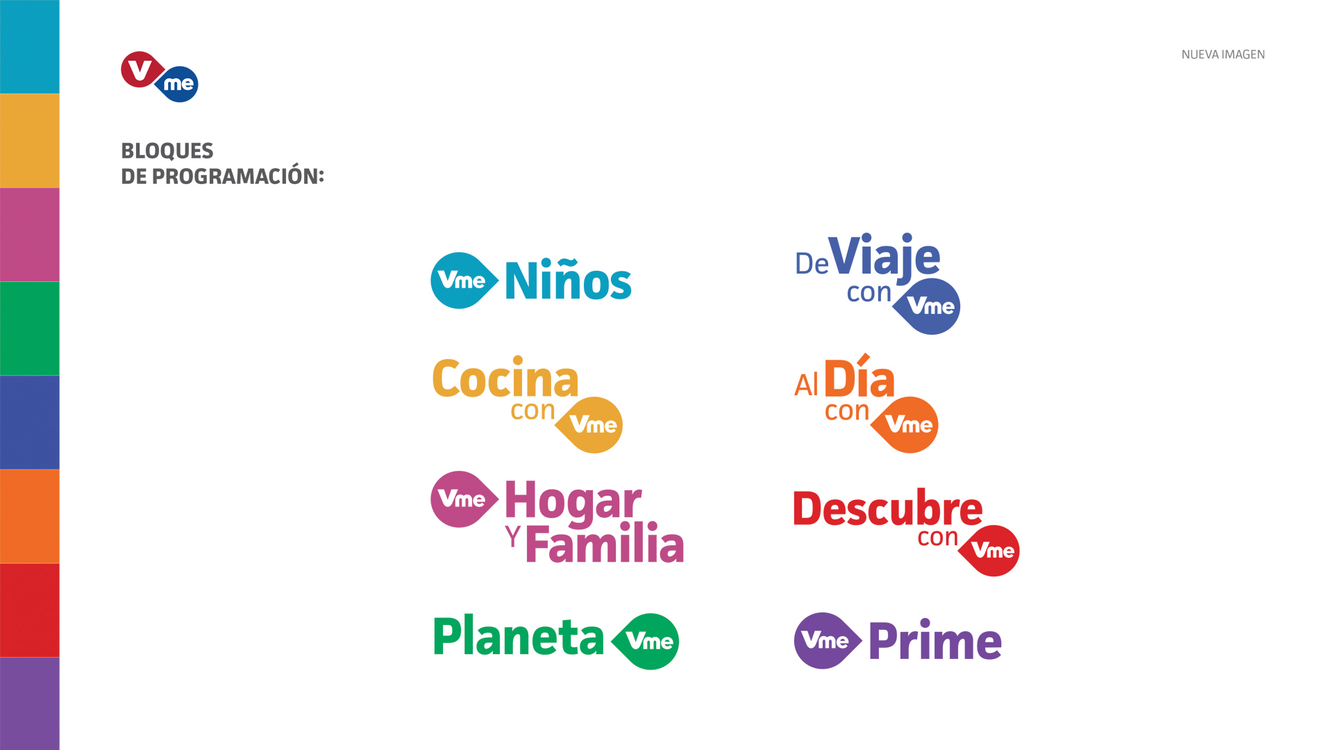
  2. Integrate 'Vme Bloques.' Be sure to emphasize each block.

  3. Optimize user engagement by better communicating the "bounty of content," thus increasing conversions.

  4. Drive up TV viewership and enourage users to watch Vme on air.

UX Research

Attributes

Cultivating brand attributes was an important step in the process because it was important to not lose sight of what makes Vme memorable and attractive to its viewers. Involving key stakeholders from the beginning was the key to a successful transition. I also took the initiative to conduct a good ol' SWOT analysis.
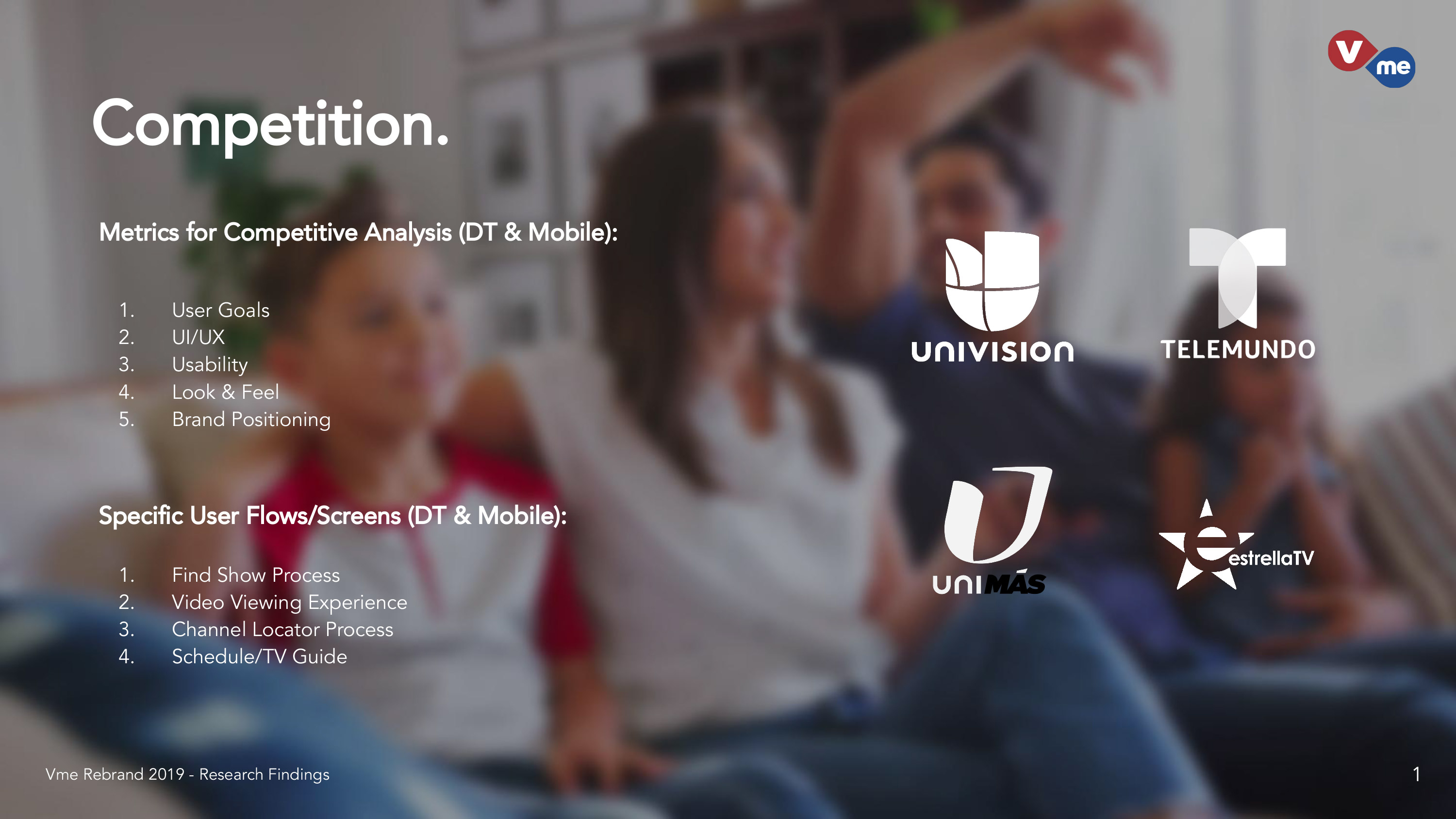
The Competitors

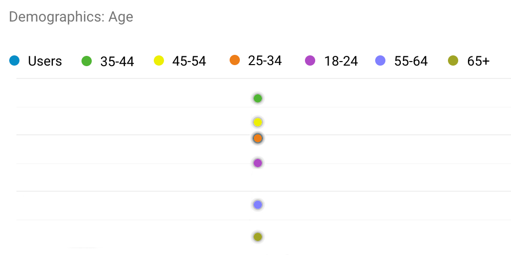
Our Marketing Manager who assisted us in Full-Scale Market Research, helped reacquaint ourselves with our target audience and competition. Since Vme was now on subscription-based cable, it had a more varying demographic to work with.

Collecting Data

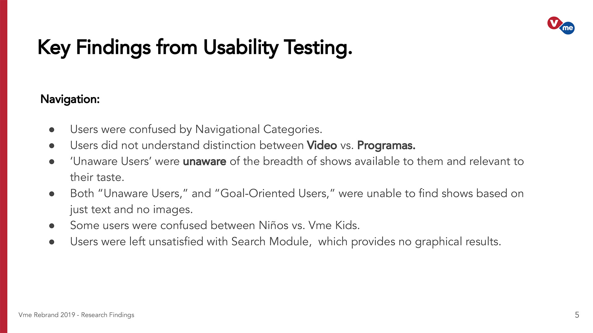
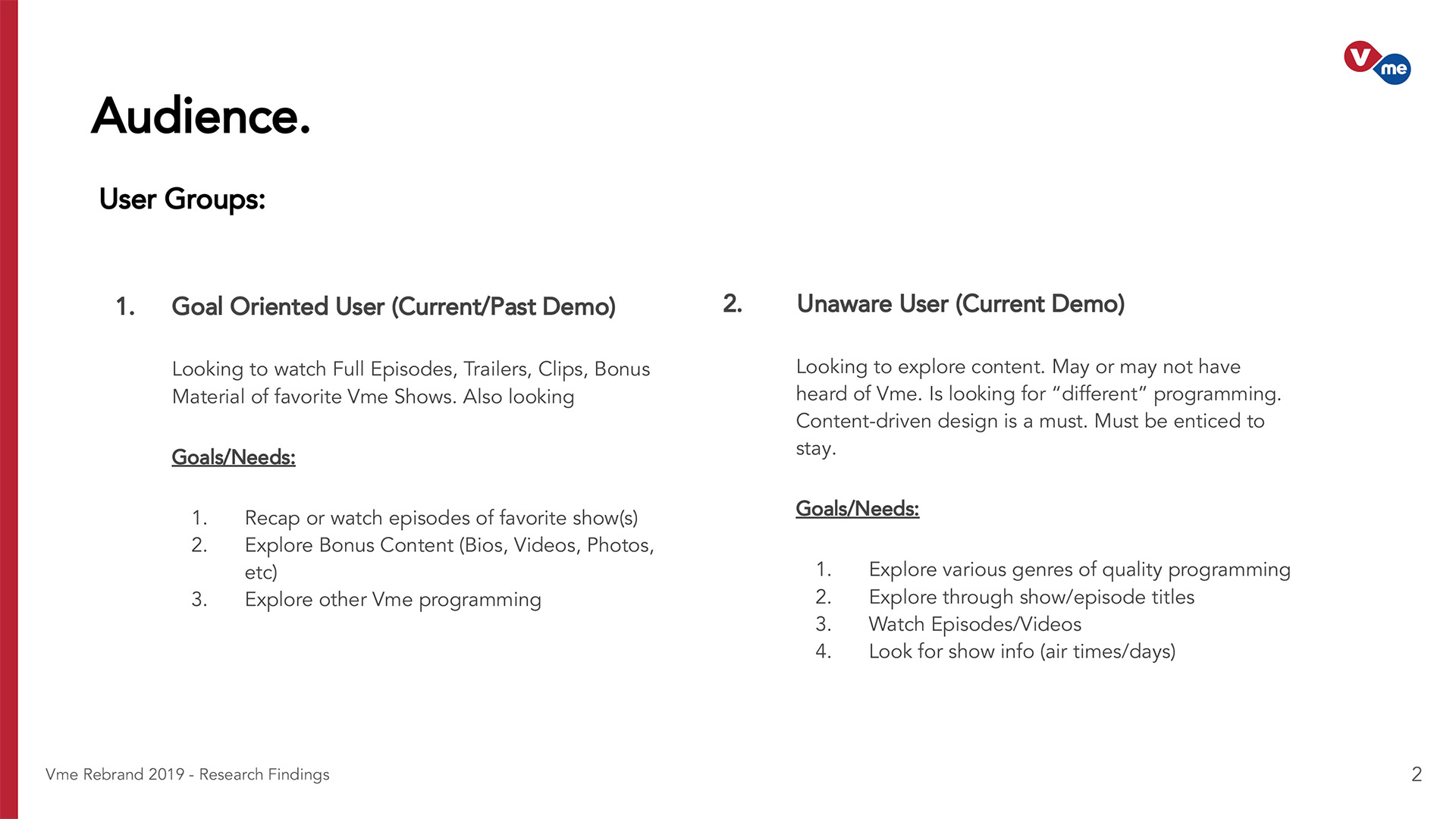
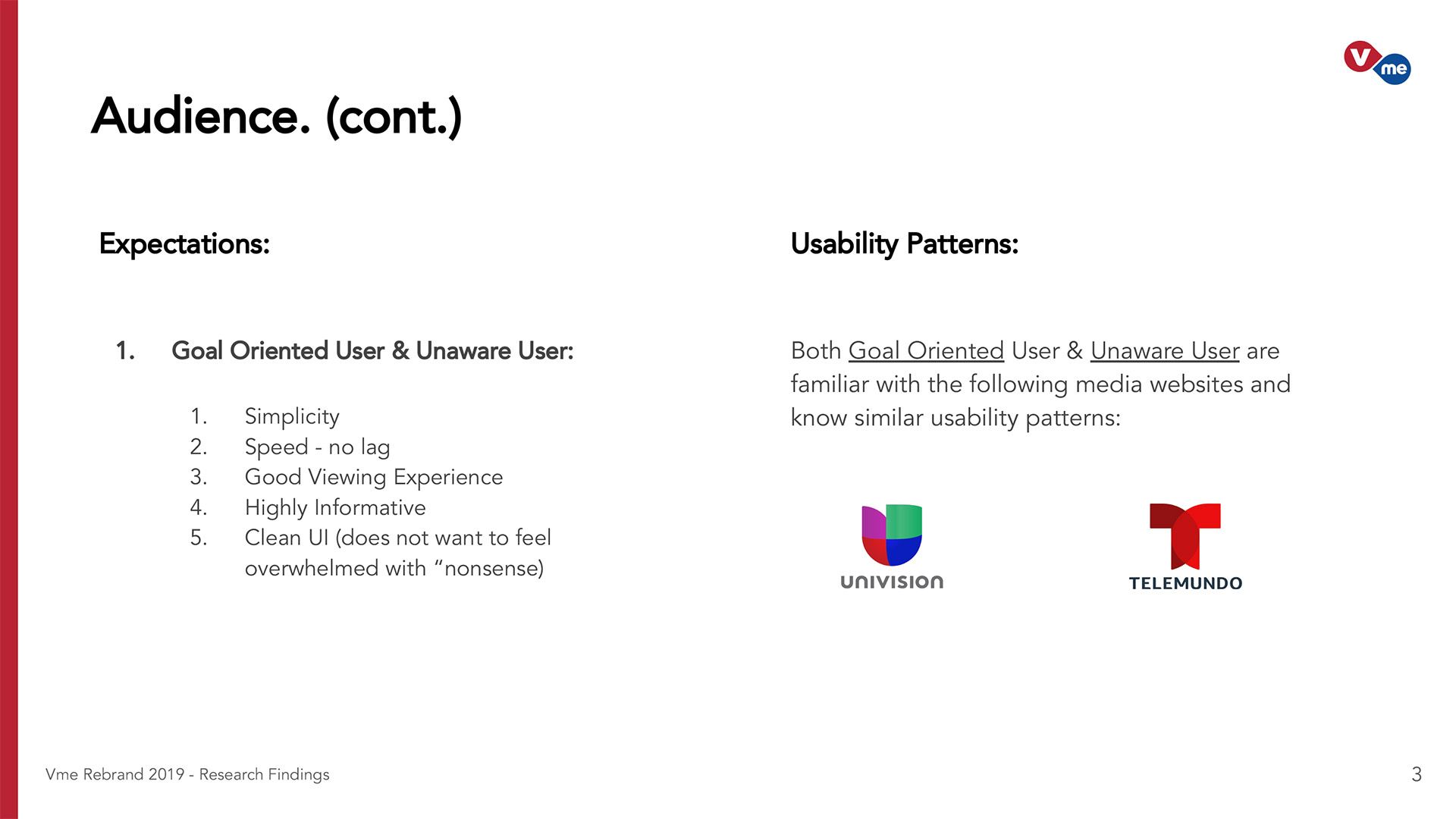
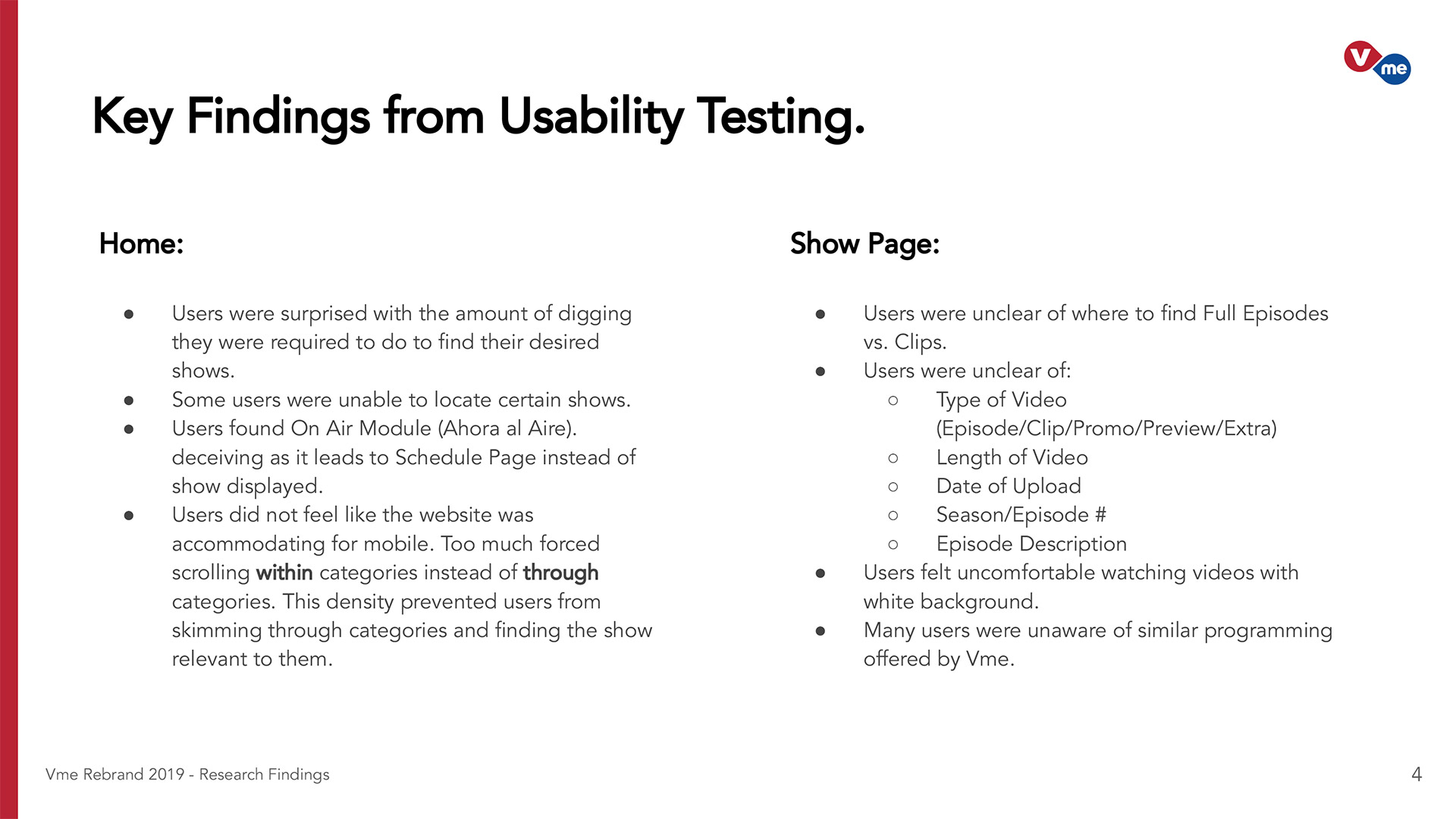
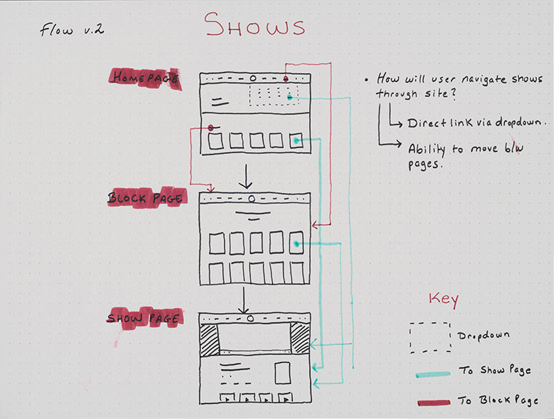
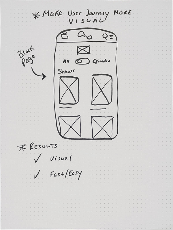
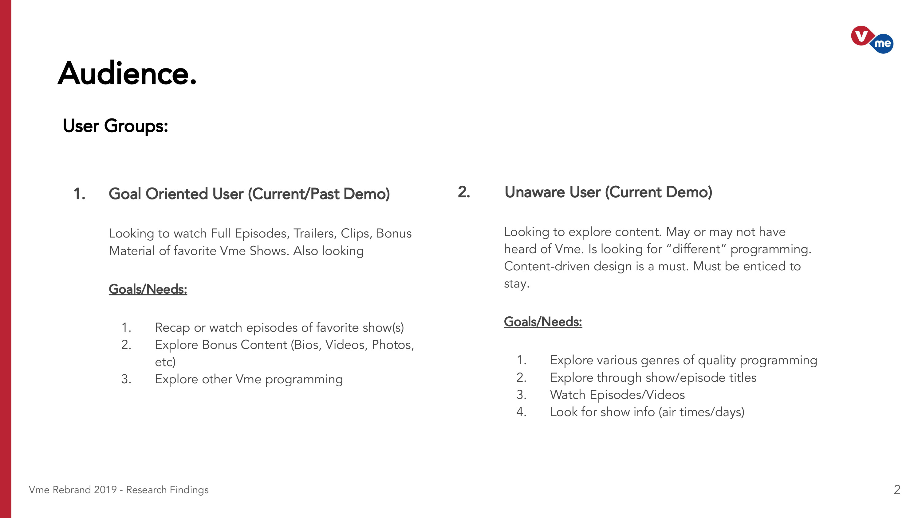
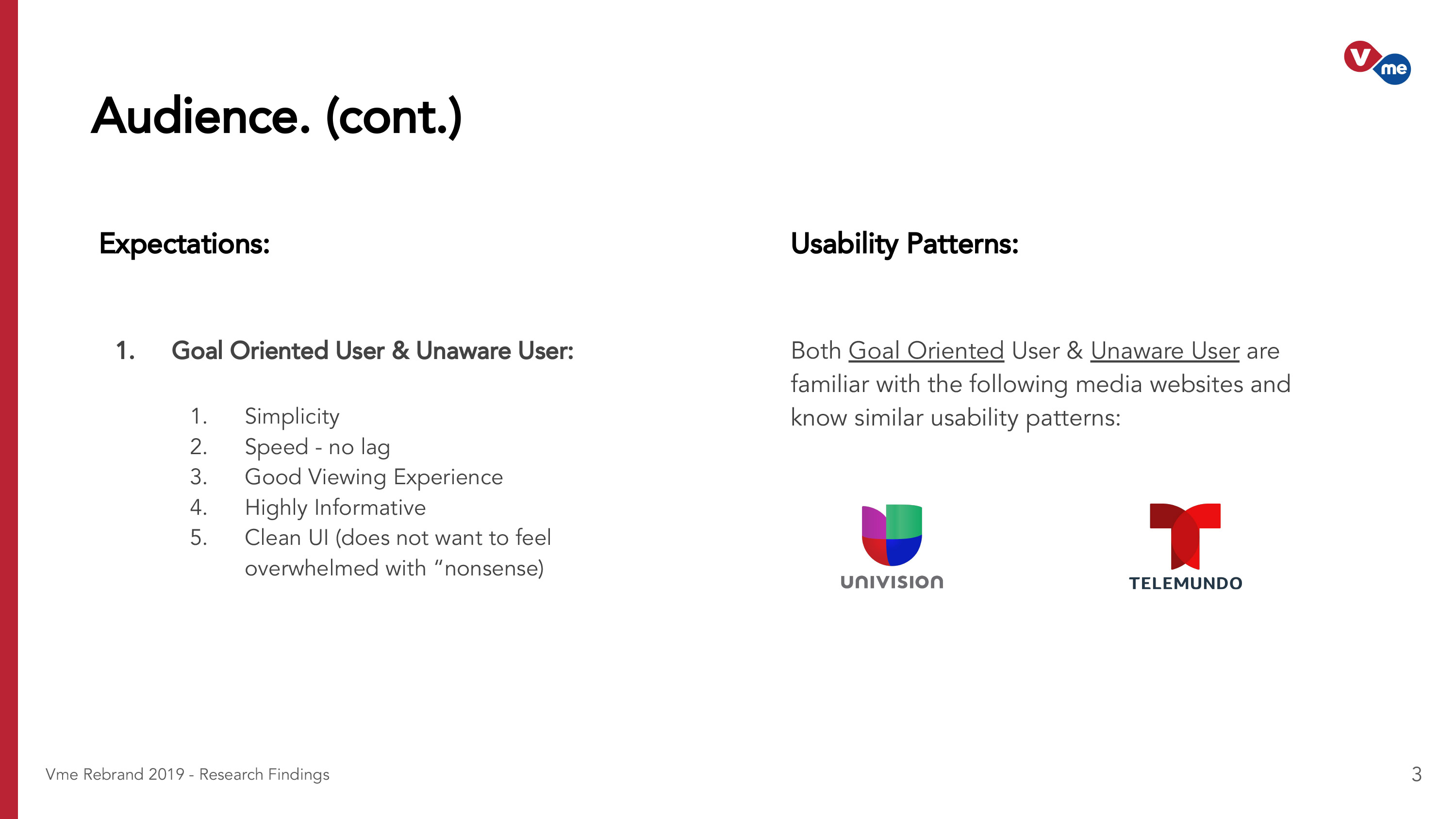
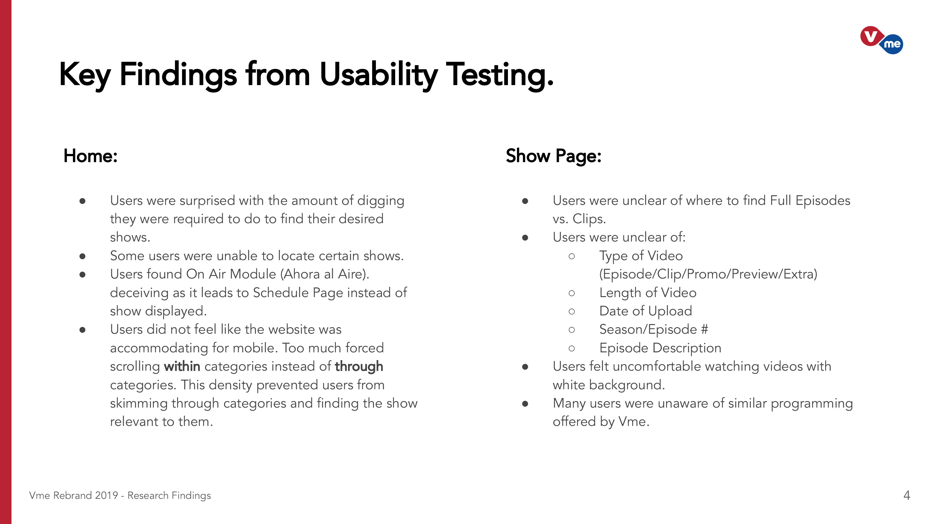
I, alongside a Researcher, collected data on the challenges and contingencies of the current Vme website which involved high quality user research conducted in lab conditions. We covered: navigation assesments, page flow analyses, and functionality-testing, asking users to perform a number of specific tasks, based on two main user scenarios: a goal-oriented user, and an unaware user.

See a simplified version of the results and data I cultivated:

UX Design

I would take on one of these Goals every week and set it as a weekly goal. Working with data collected during the Research phase, I was able to set up user flows and wireframes, which I reviewed with my team. Based on the Usability Testing that we conducted with our 15 users, we identified key navigational issues with the current design.

Based on our findings, we deducted that the user experience lacked visual ways of delivering standard information, such as programming. Users were more engaged to the screen when their shows were displayed visually and in more interactive ways.

Card Sorting

Our Card Sort informed us on how we could re-group the current website's IA and make it more cohesive. Beginning with an Open Card Sort (Monitored), we analyzed what common groups our users came up with. This was key to forming the new Navigation System. After that, we conducted a more precise Closed Card Sort and continued with creating a concise user flow.

UX Goals

By examining the flow of various tasks our 15 users undertook, I was able to understand particular pain points and garner specific Vme user goals and interaction patterns. Through this, I was able to redefine our challenges and establish a set of high level UX goals:

  1. Optmize Navigation for all devices.

  2. Improve User Journey based on qualitative and quantitative data.

  3. Simplify specific User Flows based on qualitative and quantitative data.

  4. Enhance Video Viewing Experience.

  5. Enhance Mobile Experience.

Prototyping

I used Sketch and Adobe XD to create wireframes and Lo/Mid/Hi-Fi prototypes. I communicated and handled feedback with my team through XD and after a few versions of wireframes (making sure to include everything we needed based on Research and User Testing), I moved on to designing the UI.

User testing was key in our process as we invited 10 of our previous 15 users along with 5 new users to test our Mid/Hi-Fi prototypes.

Optimizing the Navigation

Based on results from our Card Sort, I determined that the best solution at hand would be to implement a standard navigational execution, or the standard text link nav. It's a structure that our current (older demographic) users are familiar with but allows us the capablility to adjust and reshape on mobile. This way, we can accomodate a more younger demographic, one of which Vme strives to increase. It helps that the newer/younger Vme visitors are coming primarily from mobile devices.

See simplified graph sample below based on both 'Sessions by Device' and 'Demographic: Age.'

Navigational Metrics We Collected

To measure findability, I, alongside our Researcher, conducted a tree and click test on both a mid-fi and hi-fi prototype. In both types of studies, we collected many metrics to help confirm our solutions with terms and taxonomy.

Navigation Use
Whether users utlized the navigation for the task.
Task Difficulty
Users' assessment of how difficult a task presents itself.
Content Discoverability
Whether users are able to discover the content on the site.
Task Time
The time it took users to complete a given task.

The Solution

During user testing, images that were displayed immediately under each block conveyed information clearer to the user than just simply text - which elongated the process of finding a specific program. In addition, desktop users were keen on having navigational information displayed as oppossed to hidden under a menu.

Below is the flow of design iterations, from paper to high fidelity:

Visual Language

The New Navigation offers a straight forward language between the user and the task of finding or discovering content. The Dropdown has visual ways of delivering standard information.

The final designs are illustrated below. These were simple and easy for the users to follow.

On Mobile

Though the majority Vme users visit Vme from their desktop, mobile visitation is steadily on the rise, especially with Vme's new brand direction. Internally we always had the habit designing for desktop first, so in this project I looked at what the ideal mobile experience would be like and how we could reshape our design and development process to achieve a mobile-enhanced approach. Certain UX moments would change to accomodate mobile load time and ergonimics.

Block Colors

The dropdown embraces the branding associated with each Vme block.

Finding Full Episodes Fast

As per both our Goal-Oriented and Unaware User personas, one major goal/need was the ability to watch or recap full episodes. Not every program offers full episode streaming, so it was important to accentuate what shows under a particular Vme Block offered full episode recaps and what shows did not.

Below are my final sketches for mapping out the user journey and blueprint for the toggle.

The Toggle

Simple elements are often best solutions especially for filtration. What better filtration component than the infamous Toggle. This was a key component in visualizing and faciliating this particular user journey.

Below are other Hi-Fi versions of the toggle for different Vme Blocks.

More Visual. More Informative.

Our Goal Oriented Users had two objectives in mind when interacting with the Vme website:

Primary User Objective

"I want to watch episodes and extras of my favorite show."

I prioritized the Video Viewing Experience, as it is the main driving force behind both our Goal Oriented Users and our Unaware Users. The new Vme Show Page embraces the vision, ethos and aesthetics of the new Vme brand, including assigned block personalities for each program.

Secondary User Objective

"I want to learn more or discover new shows to watch."

The new environment under the video player presents the user with relevant show information and a new 'Discover' feature called, "Tambien te Gustaria," which suggests similar programming based on the user's taste.

The newly integrated JW Player even offers content discoverability when within the player, allowing for full content access even during full screen interaction. This feature offers deeper engagement and a potential to drive 35% more plays on Vme's website.

What's On Air

Another dominant deliverable based off our UCD process was a more informative On Air schedule. This new Vme schedule component offers episodic information dynamically pulled from On Air. Users can also choose to visit the program's Show Page, watch past episodes, or view other air times.

In the near future, Vme looks to build upon this feature with a Live TV feed.

New Geolocation Method

Finding the channel on air is by far one of the most important deliverables for our stakeholders. Rather than Vme's previous Input Zipcode method, (which was one of my initial projects with the company in 2017), we implemented a more dynamic approach with HTML5 Browser Geolocation.

Rather than have a user search for a channel locator and input information, the Vme site will now automatically display channel availabilities based on a general IP location. Expandable information is available upon clicking location on the static navbar.

Automated Display for Unique Visitors

Our Card Sort informed us on how we could re-group the current website's IA and make it more cohesive. This was key to forming the new Navigation System. After that, we continued with the first version of wireframes.

Our Card Sort informed us on how we could re-group the current website's IA and make it more cohesive. This was key to forming the new Navigation System. After that, we continued with the first version of wireframes.

Contacting Cable Providers

Vme's numbers are on the rise and the demand for cable providers to distribute Vme's airwaves also shares that same trajectory. We've simplified the process of contacting cable operators that don't distribute Vme.

Of the 10 research participants, 2 of them did not have Vme available in their area. This new system of contacting their designated cable providers faciliated the journey for "Demanding Vme."

Previous Work Next Work